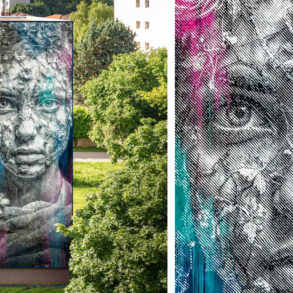

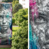


You started creating graffiti art in the early ’90s with the San Jose–based underground hip hop group Full Time Artists (FTA). What was the scene like back then, and how did you get into writing graffiti? Man, I’m really happy that I had my childhood in the ’80s and my teen years in the ’90s. I feel like that was very lucky. The world before the internet, smartphones and social networks was so much more mentally healthy and so much simpler. We had the internet, but it was far less ubiquitous, less relevant. The underground scene was a real-live social network, worldwide but still very esoteric and special. You really felt like you were a part of something if you earned a place in that environment. You had to get out there and hustle, put in work. Only performance and merit really mattered. In the internet age, I think people are struggling to adapt to the very rapid pace of change. There’s a certain schizophrenic aspect to having access to everything everywhere all the time—especially now, the way that abyss tends to gaze back into you.
I stumbled into the underground scene and graffiti art via the kids in my neighborhood and in school. Back then, we could spot each other a mile away from cues in fashion or language like members of some secret society. If you knew about certain artists or elements of the history, you had an automatic bond. We just coalesced over time, the remnants of the old-school hip hop scene folded into the emerging new-school underground scene as gangster rap and a commercialized version of the culture veered off into another lane. I was always an artist since I was a kid, imitating comic book, video game art and graffiti, but graffiti has this endless variety, and the aspect of danger and camaraderie was an instant and apparently permanent obsession.
The FTA crew was like an all-star team. We were all from different cities and different schools. Each of us recruited some of the best writers around us. We surrounded the crew with our closest homies and family members. We all met through graffiti, but FTA has emcees and DJs, breakers, and music producers. Every guy or girl does more than one thing. We definitely subscribed to the original “four elements” theory of hip hop: DJing, MCing, breakdancing and graffiti art.
From FTA, you established the Graffiti Fonts type foundry in 1999 specifically to bring the world of graffiti into the digital realm. What intrigued you about the possibilities of creating graffiti art in digital design? I hated computers. I was unimpressed watching them crash and lag trying to process my artwork or looking at the nasty pixels attempting to approximate smooth flowing lines. I loved video games and the pixel art in them, but I saw it as a very separate style. In high school, my mother—a graphic designer in the pre-digital age—introduced me to Adobe Streamline and Illustrator, and I started to change my mind. Vector graphics could be even better than hand-inked artwork. The editability and scalability won me over, and by about 1994, I was doing vector graffiti art. I was doing a lot of album covers and fliers, among other things, and people came to me for graffiti lettering. Not all fonts were vector based at that point, but I realized fairly quickly that one could create a vector-based, graffiti-style font. It hadn’t been done. The confluence of circumstances made it seem like it was my destiny to be the first to do that. Once I started, I just couldn’t stop.
I see graffiti as the modern incarnation of calligraphy, and I see writing as humanity’s most profound talent. I don’t see type as a replacement for writing; I see it as an extension and amplification of writing. Type should carry forward more than just the content of the written word; it should also attempt to preserve its aesthetic beauty and cultural characteristics as best as it can. Graffiti is saturated in a culture of its own making and the surrounding culture of the moment. It’s connected intimately to all of the times, places and people that it inhabits. It’s a good thing to preserve that, so I just keep trying.
As Graffiti Fonts, you’ve had numerous high-profile clients in a broad range of industries, from fashion brands to entertainment to the National Security Agency (NSA). What have been some of your favorite projects you’ve worked on, and how did they change your perception of what you can accomplish with graffiti? Yeah, the NSA… I’ve sent font collections to deployed soldiers in the Middle East, battleships in the middle of the ocean. Graffiti is very American. As a genre, it has no limits. It has its core elements, disciplines and methods, but it’s not confined by those. I learned graphic design from graffiti. I learned lettering, typography, color and layout from graffiti. Graffiti was the product that required me to learn graphic and web design as well as the technical skills that I needed to publish my own work. I worked at a machine shop for several years in my teens and twenties, and that just deepened my view of what could be accomplished by bringing this work into the digital realm. I’ve been self-employed since I was a teenager. I opened my first website in 1997 at nineteen years old, and all of those clients found me and either contracted me or licensed my material based on what they saw. I’m a high school dropout and a college dropout. I have no connections to the corporate world.
One of my favorite jobs wasn’t actually a design job and didn’t involve any fonts. I was hired by the video game company THQ to provide a large array of real graffiti art for a video game called Homefront. That gig allowed me to develop an entire fictitious world of writers, crews, gangs, slogans, content, techniques and motivations that would produce a blanket of graffiti to cover the environment in an apocalyptic, occupied America. I was able to just paint pieces, tags and throws with all of the traditional tools of graffiti artists as well as those of random fictional people living in desperate times. I developed a huge array that included a mix of very crude and very sophisticated elements. I had tons of fun creating hundreds of elements for that project, painting nice pieces then damaging them grievously.
Ironically, only a small amount of the graffiti appears in the final game because it was taxing the processor to replace so many repeating textures with unique artwork. Choking computers with graffiti has been somewhat of a theme throughout my career. It’s forced me to learn a ton about optimization. Apparently, graffiti is pretty good at choking computers. It seems pretty good at choking AI too. Maybe that’s why the NSA wanted some.
Generative fonts can do things that other fonts can’t. I do consider it to be a new breed of font. I predict that as time goes on, they might be a new category along the lines of variable fonts, color SVG fonts, layered type systems or contextual fonts.”
Tell me about your recent work ManyStyles, a generative graffiti font that provides each individual user with one-of-a-kind, unique alphabets. What inspired you to create it, and how did you use technology to achieve it? Where do you look for inspiration lately? Well, it’s not AI. The word generative is used in that context a lot these days, so I’ve noticed that most people assume AI is involved. But AI has no part in the development of these generative fonts. It’s all human ingenuity, design and coding. The end product is a normal font that anyone can use in any application on any system. No special plug-ins or other accommodations are needed.
With that said, generative fonts can do things that other fonts can’t. I do consider it to be a new breed of font. I predict that as time goes on, they might be a new category along the lines of variable fonts, color SVG fonts, layered type systems or contextual fonts. We’ve had to work simultaneously for what is fully supported right now and what will definitely be supported as time goes on. So, in our first iterations, we’ve used the technology to deploy individually unique, one-of-a-kind fonts. No two users will have the same generative alphabets.
After about 25 years designing fonts, I’ve developed a number of systems for creating very broad arrays of characters for large font families, contextual alternates and stylistic sets, among other things. I was listening to the Monotype podcast and heard Craig Ward talking about the NFType project that he was launching, which would pair one-of-a-kind typefaces with blockchain NFT technology. His descriptions of what he wanted to do lined up very well with some of my own work. I reached out to him and ended up joining the team. It’s a different use of the technology than I had originally intended but it had the advantage of wider, immediate support. I like “firsts,” and a one-of-one digital font is a first.
ManyStyles is an offshoot of one of my preexisting contextual typefaces called StyleWriter and was initially developed to be released as an NFT through the NFType foundry. I have several generative font families in various stages of development. Through those, I’m working to standardize the generative methodology and push the boundaries of what’s currently supported in the major design apps.
Inspiration comes from everywhere, but as a graffiti artist, it’s expected to take as little direct inspiration from other graffiti as possible. There is an appropriate passing on and maintaining of traditional styles and an unavoidable observance of innovations in technique, but for better or worse, I have ten lifetimes of inspiration already waiting in line to be executed. I try to ignore the constant cyclic shifting of design trends and just stay on mission. Life is short.
What challenges you the most about being a type designer, as a digital designer or as a graffiti artist? I wouldn’t say being a graffiti artist to be particularly “challenging”—it’s entirely free. The liberty is absolute. It’s extremely competitive, but challenging is not quite the right word. You don’t have to compete to contribute, and you don’t have to care what anyone thinks about your work.
As a graphic designer, one of the biggest challenges has always been the aforementioned design trends. Clients will often request something that looks like something else they’ve seen, while their source material, subject matter and budget can sometimes make executing that difficult. I don’t like imitating things and worry that as that trend shifts, the client will come to regret their choices because they could have devoted their resources to something with more longevity. But the customer is always right, so you try to provide expertise but, ultimately, just do what the client wants.
As a type developer, the biggest challenge by far has become the hyper dominance of a few particular tech companies and their promotion and sponsorship of piracy, aggregators and low-quality free content over original, authoritative and legitimate sources. From my perspective, organic search, social and the emerging ad networks from 1997 to 2012 were the best friends of every independent creator. In the years since, it has become a total nightmare and just gets worse all the time. In my opinion, they manipulate things so much that it disrupts the free market and makes things very difficult for small businesses. People who were not in the game before this sudden switch will never know what they’ve missed. Again, I have to consider myself lucky with the timing—I started before Google or Facebook were factors, so I learned how to operate without them as an asset or even with them as a problem.
What excites you about the world of type design right now, and what emerging technologies will change the way you design fonts in the next few years? Given what we’re doing with generative fonts, I’m excited to see expanding support for more of the capabilities within the expansive OpenType spec. Whole new worlds of functionality continue to emerge over time. Graffiti lettering defies the mechanics of type by its very nature, so the more type can emulate natural writing, the better. Similarly, the spreading support for color SVG fonts is obviously extremely useful in the graffiti space. We made a ton of “layered type systems” over the years, and color SVG fonts are a natural progression and expansion of that concept. Variable fonts are amazing. I’m doing some pretty strange stuff in that department, but also, variability in the traditional sense is very useful to the wild, abstract forms of graffiti lettering that can benefit a lot from being dialed up or down to balance the funk with the function.
Do you have any advice for creatives entering the field today? “The field” is getting harder to define. Everything is converging and mixing. I have always benefited from the fact that I was forced to develop a wide skillset so that I could be self-publisher and a one-stop shop for a business. Any gig you do for a client can lead to more gigs for that client. The wider your skillset, the more opportunities will open and the more complete your understanding will be of your work within the greater context of everything that client needs. You’re more effective at your job when you understand the jobs around you and how they interact. With that said, you should decide what you’re best at and be the best at it. Excel, innovate, have a specialty and be special. Be a total badass at one particular thing, capable of improving upon or building from anything that you see. That will be the thing that gets your foot in the door. ca
This post was originally published on this site be sure to check out more of their content.