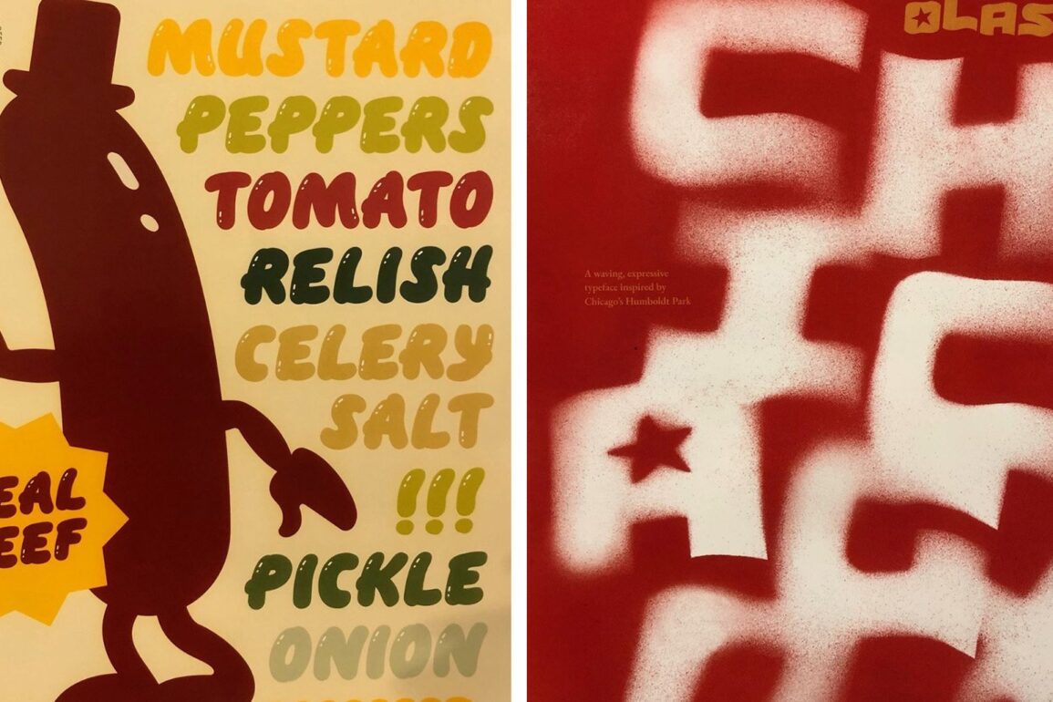
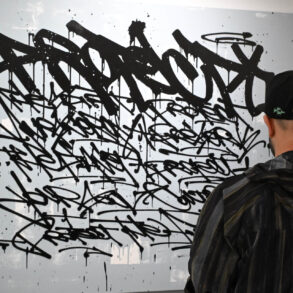
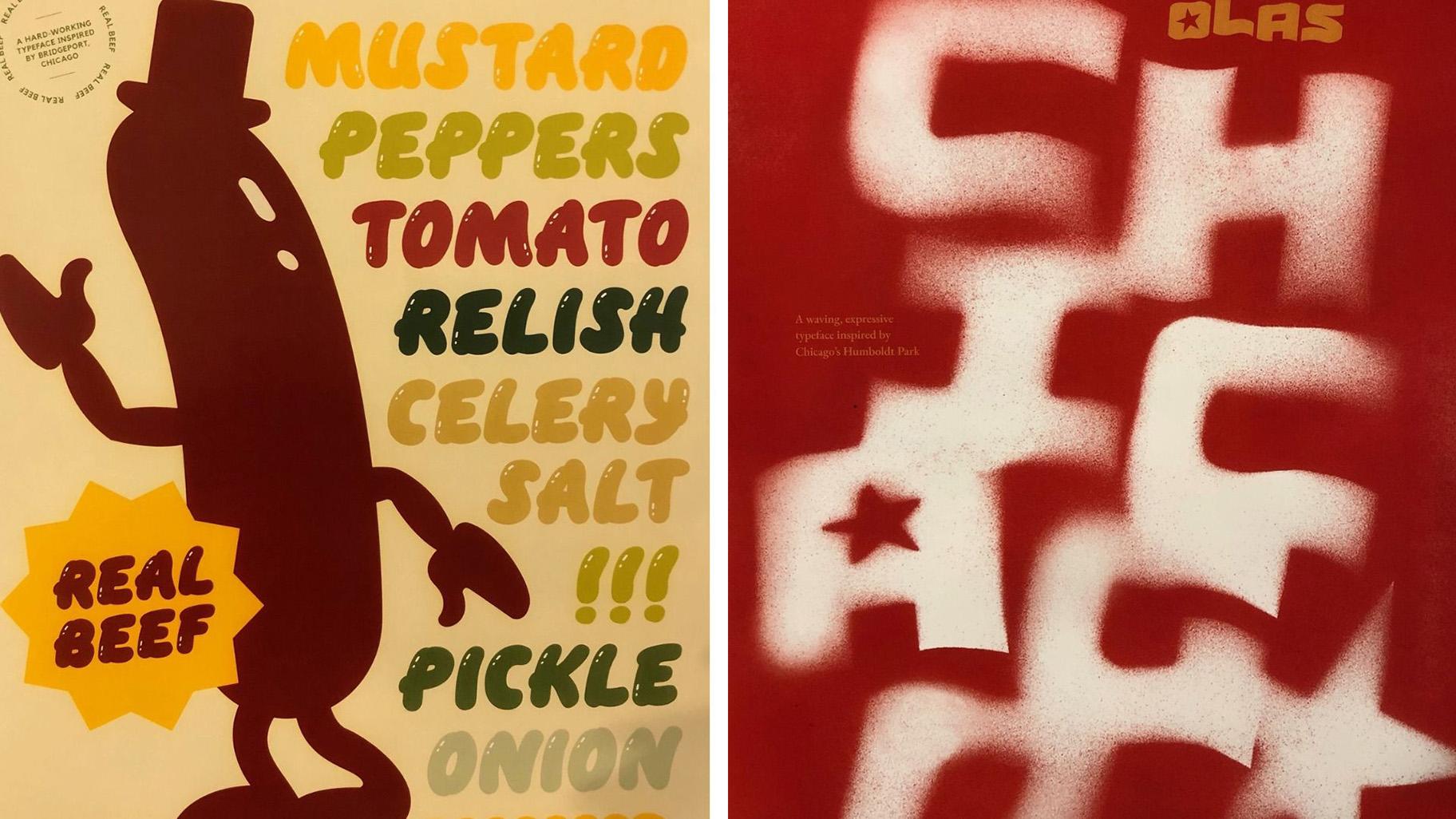
 Fonts on display in the “Letters Beyond Form: Chicago Types” exhibit at the Design Museum of Chicago.
You might think: “Design Museum? What Design Museum?”
Thanks to our sponsors:
Here’s the scoop: It’s free, it’s walking distance from Millennium Park, and it currently has a show about different types in Chicago.
Not stereotypes, not daguerreotypes, but letter forms — the shapes and styles of typography. It’s a big fountain of fonts for design nerds to splash around in. There are also new fonts that are free to download and use (more on that in a moment).
“Letters Beyond Form: Chicago Types” is a modestly scaled but ambitious exhibition currently occupying the Design Museum of Chicago on Randolph Street across from the Chicago Cultural Center.
“The museum mission is frankly that design is everywhere,” curator Amira Hegazy told WTTW News. “Everyone in one way or another is designing and interacts with and around design. If you organize your closet and fold things in a certain way, that’s design.”
Hegazy is an artist who teaches design practice and theory at the University of Illinois Chicago.
Now she’s crafted a love letter to the lettering of Chicago.
“Letter forms are all around us,” Hegazy said. “We read them and think of them as information but don’t always look at how type changes the way we understand information. You can make a joke or make a really strong point just by changing the font — having it in comic sans versus Helvetica makes a totally different statement.”
It’s an inclusive show with historic samples from Chicago publishing alongside contemporary posters, painted signs and AI-generated artwork.
“I learned from different lettering practitioners in the city and tried to understand how people design and work — both those who are trained in design in classical ways and also those who learned design through their community, by living in it and talking to people,” Hegazy said.
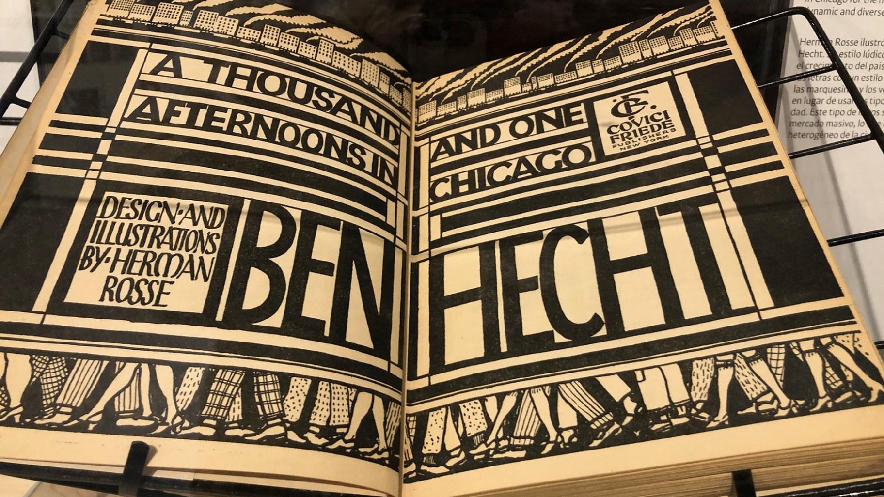 Fonts on display in the “Letters Beyond Form: Chicago Types” exhibit at the Design Museum of Chicago.
Hegazy got her graduate students involved, and one of them designed a hot dog font inspired by Bridgeport.
“That student did research into the history of the neighborhood,” Hegazy said. “They were thinking about the stockyards and the mystery meat in the hot dog, but then also thinking about Chicago politics and the mystery meat that goes into politics.”
The curator’s R and D took at least one unexpected turn.
“As part of my research I joined a graffiti crew and ran around with them for six months, which is a great privilege of being both a researcher and an artist,” Hegazy said. “I could actually go and learn on-site from people.”
OK — did she get busted?
“I did not personally, and that’s part of the reason why I limited my time with them,” Hegazy said. “Also, being a woman — there’s not a lot of woman graffiti writers.”
She continued: “We’re not promoting graffiti as in ‘You should go tag something,’ but to see those things and to respect them, to understand that, wow, this is a big tradition and there’s meaning in it. We’re just trying to bring all of that into the same space.”
The exhibition website offers four free typefaces designed by students at U of I. Each font was inspired by a different neighborhood, so download them for a Chicago-inspired look to your next party invitation.
They might even be persuasive.
“To make design, to understand design, is like brainwashing sometimes because people don’t always understand what design does to them,” Hegazy said. “But it compels them in really intense ways. On a most basic level, we’re hoping that people will just notice it and pay more attention to typography.”
The exhibition “Letters Beyond Form: Chicago Types” is part of Art Design Chicago — a citywide initiative of the Terra Foundation for American Art. The show runs through April 4, 2025.
Funding for WTTW’s arts coverage as part of Art Design Chicago, a citywide collaboration highlighting the city’s artistic heritage and creative communities, is provided in part by the Terra Foundation for American Art.
Marc Vitali is the JCS Fund of the DuPage Foundation Arts Correspondent.
Thanks to our sponsors:
Thanks to our sponsors:
This post was originally published on this site be sure to check out more of their content.
